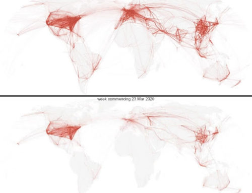
Covid-19 masquerades in ambiguity. In the past few months, mixed messaging from the U.S. federal government and the lack of a coherent national action plan have left individual states to take inconsistent (in)action regarding this pandemic. Without comprehensive testing, the narrative of the virus has become increasingly hard to locate. Viral contamination spreads silently and invisibly, and is revealed to individual patients or providers only days or weeks later through selectively interpretable symptoms. Covid-19 is undeniably visible in the experience of those who directly confront the suffering and harm it leaves in its wake. For many, however, the pandemic has remained a more abstract threat: something imagined in myriad ways and marked by an ambiguous presence that seems to resist local contextualization or efforts at visualization.Where circulating images of masked healthcare workers failed to fully capture the virus’s capacity to kill, numerical predictions of risk, too, began to fluctuate–resting on incomplete data and making already complex modeling feel even more unstable and obscure (The Wall Street Journal Editorial Board 2020). Within these complex and conflicting narratives, visual abstractions of the virus’s trajectory have come to stand in for projections of future risk. Slippery by definition, these hypotheses have now come to translate and narrate both the pandemic’s past and potential future. Such images have therefore been asked to do substantial political and epidemiological work: transforming possibilities into comprehensible futures. Early public questions asking “What should be done?” thus prompt us to ask: What is the affective work of visual models? How might a graph be asked to communicate urgency and inspire a collective orientation towards the future? And what has this set of “image-events” revealed about the fragile intersection of collective life and individual dependence (Strassler 2020)? Rather than answer each of these questions, we pose them to note the moment, the transformations, and the lives we are now being asked to live.
Flatten The Curve: An Image-Event
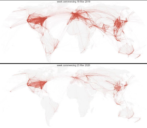
Beginning in mid-March of 2020, citizens were asked to create new affective links among panic, optimism, and action in the absence of reliable numbers or effective federal leadership to anchor a response narrative to Covid-19. In this essay, we explore how grassroot attempts to depict the imminent scale of the pandemic began to surface, the most successful of which was the “Flatten the Curve” image and sentiment that gained viral traction during this time on news and social media platforms. This graphic succeeded where previous efforts had failed: it conveyed a sense of urgency directly to the American public.
The emergence of Flatten the Curve, we argue, became a political “image-event” as new representations of peaks and plateaus “erupt[ed] onto and intervene[d] in a social field, becoming a focal point of discursive and affective engagement across diverse publics” (Strassler 2020, 9-10). Through this process, portions of the United States’ population mobilized around its conceptual narrative. These processes of “atmospheric attunement” (Stewart 2010, 449) compel us to consider how crises “induce collective responses and produce their own affective temporal orientations” (Bryant and Knight 2019). By approaching the reverberations of “the curve” through a lens of affect, we highlight the ways it has become a site of political intervention and an orientation towards individual responsibility, mobilizing a visual narrative that appeals to a collective promise.
Towards a Flatter Future
The defining visual image of this pandemic and political moment has thus become a highly conceptual mathematical representation. We argue that it is precisely because it is conceptual, and not anchored in specific numerical values, that it has captured the public imagination. It reorients us towards a vision of the future that, like the arrow that forms the x-axis, “time,” only points in one direction: forward.
Although Flatten the Curve is not a new concept in epidemiological circles, it has become reanimated for this specific moment and is now a publicly recognizable concept. The first iteration of Flatten the Curve was published in 2007 by the CDC in a paper that explored community mitigation strategies in a pandemic scenario similar to Covid-19. However, it wasn’t until Dr. Drew Harris, Assistant Professor at the Thomas Jefferson College of Population Health, took the CDC graphic and added the dotted “healthcare capacity” line that the image gained traction on social media and went viral (Wilson 2020). According to Harris, the line was a purely theoretical invention, not rooted in hard data but drawn arbitrarily to emphasize the importance of mitigating strategies (Wilson 2020).
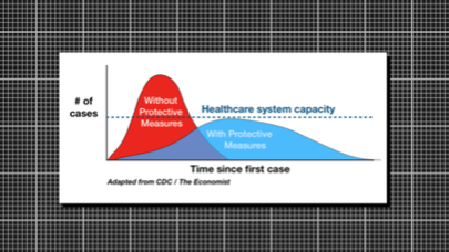
The Flatten the Curve graphic situates viewers at the origin of the graph– a shared hypothetical present from which two disparate curves extend outward and upward as cases build through time. These curves provoke the viewer to imagine two sets of future possibilities. One future unfolds in the absence of protective measures, with Covid-19 cases quickly exceeding the dotted “healthcare capacity” line, overwhelming hospitals and increasing fatalities. In the other future, we have taken action. Masks, social distancing, and other protective measures have been put in place, and the number of cases remains within the healthcare system’s limits. The graph prompts the question: Which future do we choose?
The Dotted Line
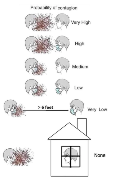
The dotted line transforms the graphic, in part, because it “establishes the edges of our horizon” (Ahmed 2010, 24). By situating healthcare capacity to treat patients at the center of the narrative, “[it] defines the places that we know we do not wish to go” (Ahmed 2010, 24). The existence of a threshold (even if arbitrarily drawn) dramatically increases the affective potency of the image: mobilizing fear to orient its audience away from futures that manifest beyond the dotted line while summoning hope that collective action can flatten the curve. Both of these orientations demand a reconfiguration of everyday action in the present to align with protective measures (Knight & Bryant 2019). While Flatten the Curve connects present action with collective futures, it remains fundamentally abstract. It is through its circulation on news and social media platforms that the image accrues “symbolic density” in which various interpretive communities circulate personal narratives that expand, refine, and contest what constitutes appropriate action to flatten the curve (Strassler 2020, 13). This process also involves the personalization of risk and fear in order to maintain a sense of urgency. The visual below, for example, explicitly links individual actions and attitudes with the height of the curve –presenting the calm yet responsibilized citizen as the personification of a manageable curve.
via GIPHY
Living the Curve
“Flatten the Curve” thus demands attention–and action. As infection rates began to increase in the United States, this image also became a tool through which to attune to an atmosphere of urgency. The emergence of #flattenthecurve and circulation of “Keep Calm and Flatten the Curve” frames on social media platforms have established a way for individuals to not only display adherence with social distancing, but also generate a shared atmosphere of attunement. Conveying these actions visibly and virtually have become “a lived affect–a capacity to affect and to be affected that pushes a present into a composition, an expressivity, the sense of potentiality and event” (Stewart 2010, 452). Attaching oneself to this conceptual narrative arc thus invokes a collective political effort. The circulation of hashtags specifically centered on events can further allow individuals “who are territorially displaced to feel like they are united across both space and time” (Bonilla and Rosa 2015, 7). Within this shared sense of temporality, specific orientations towards collectively imagined futures can also be experienced together.
Thinking of Flatten the Curve as an image-event underscores its polyvalence: the ways in which it both accrues meaning and animates new images and texts, “deepening certain tones and deafening others” (Strassler 2020, 15). Streamlining a complex set of narratives into a seemingly straightforward message, the image and language of the curve visually anchor a call for behavioral response. Invoking the authority of (albeit hypothetical) data, it seeks to orient its audience towards a collectively imagined future where the slowly rolling hill of manageable Covid-19 infections displaces the steep mountain of cases that quickly overwhelms healthcare capacity. These attempts to mobilize, however, rest on the assumption that individuals will envision themselves as part of an imagined public—anchoring themselves in this abstraction. The processes and publics summoned by this image-event have helped mediate urgency and immediacy to collectively orientated futures, imploring us to stay home, wear masks, and social distance in the present.
An Archive of an Era
As weeks become months, the pleas and afterlives of “the curve” have multiplied. Shifts in outcomes suggest to skeptics that the curve was always a tool for political manipulation, even as others view those results as validation of protective measures. The curve’s malleability is thus its most lively and vulnerable quality. Although our choices result in spikes and plummets, the dotted line of systemic capacity appears unmovable. If the curve of individual responsibility bends to our will, the dotted line of resource allocation, governmental responsibility, and institutional authority stands uncannily still.
Flatten the Curve is thus an open-ended archive of the contested and political imaginaries that shape the era of Covid-19. At the time of this writing, it continues to be a widely circulating and galvanizing political image. It remains to be seen how the image will persist as the pandemic unfolds in the United States. As cases start to decline across the U.S., will Flatten the Curve retain its urgency, reinforcing social precautions as a vaccine is developed and distributed? How might the conversation around healthcare capacity shift in response to the threshold that has been drawn? Or will it become a part of our lexicon for crises, poised for deployment in the future?
References:
Abutaleb, Yasmeen, Dawsey, Josh, and Greg Miller. 2020. “The U.S. Was Beset by Denial and Dysfunction as the Coronavirus Raged.” Washington Post, April 4, https://www.washingtonpost.com/national-security/2020/04/04/coronavirus-government-dysfunction/
Ahmed, Sara. 2010. “Happy Objects.” In The Affect Theory Reader, Melissa Gregg and Gregory J. Seigworth, eds., Durham: Duke University Press, pp. 29–51.
Bonilla, Yarimar, and Jonathan Rosa. 2015. “#Ferguson: Digital Protest, Hashtag Ethnography, and the Racial Politics of Social Media in the United States.” American Ethnologist 42(1): 4–17.
Brumfiel, Geoff. 2020. “To End The Coronavirus Crisis We Need Widespread Testing, Experts Say.” National Public Radio website*, March 24, https://www.npr.org/sections/health-shots/2020/03/24/820157519/to-end-the-coronavirus-crisis-we-need-widespread-testing-experts-say
Bryant, Rebecca, and Daniel Knight. 2019. “Orientations to the Future: An Introduction.” In “Orientations to the Future,” Rebecca Bryant and Daniel M. Knight, eds., American Ethnologist website, March 8, https://americanethnologist.org/features/collections/orientations-to-the-future/orientations-to-the-future-an-introduction.
Qualls, Noreen, Alesandra Levitte, Neha Write-Jegede, Stephanie Dopson, Matthew Biggerstaff, Carrie Reed, et al. 2017. “Community Mitigation Guidelines to Prevent Pandemic Influenza–United States, 2017.” MMWR. Recommendations and Reports 66(1): 1-34.
Stewart, Kathleen. 2011. “Atmospheric Attunements.” Environment and Planning D: Society and Space, 29(3): 445-453.
Strassler, Karen. 2020. Demanding Images:Demoncracy, Mediation, and the Image-Event in Indonesia. Durham: Duke University Press.
The Editorial Board. 2020. “The Art of Coronavirus Modeling.” Wall Street Journal, April 7, https://www.wsj.com/articles/the-art-of-coronavirus-modeling-11586301975?cx_testId=3&cx_testVariant=cx_2&cx_artPos=1#cxrecs_s
Wilson, Mark. 2020. “The Story behind the Coronavirus ‘Flatten the Curve’ Chart.” Fast Company, March 13, https://www.fastcompany.com/90476143/the-story-behind-flatten-the-curve-the-defining-chart-of-the-coronavirus
Cite as: Storz, Lauren and Anna Wynfield. 2020. “How to Sense a Pandemic: Curves, Models, and the Affective Allure of Flattening.” In “Pandemic Diaries: Affect and Crisis,” Carla Jones, editor, American Ethnologist website, May 20 2020, [https://americanethnologist.org/features/pandemic-diaries/pandemic-diaries-affect-and-crisis/how-to-sense-a-pandemic-curves-models-and-the-affective-allure-of-flattening]
Lauren Storz and Anna Wynfield are Ph.D. students studying cultural anthropology at the University of Colorado Boulder.